GitHub Responsive Web Experience
Improving the GitHub Responsive Web Experience After 7 Years
Project & Design Lead
Planning & Scoping, UX Research, Wireframing, Prototyping, Visual Design, Front-end Development, Quality Assurance
Product Designers (4x)
Software Engineers (2x)
GitHub
Productivity & Developer Experience
Shipped
Introduction
In 2013, GitHub responded to the growing trend of mobile usage by launching a mobile site, aiming to provide a better experience for users accessing the platform on their phones. However, by 2020, GitHub decided to eliminate this mobile site due to the challenges and inefficiencies of maintaining multiple codebases, which resulted in a divided user experience and hindered feature development.
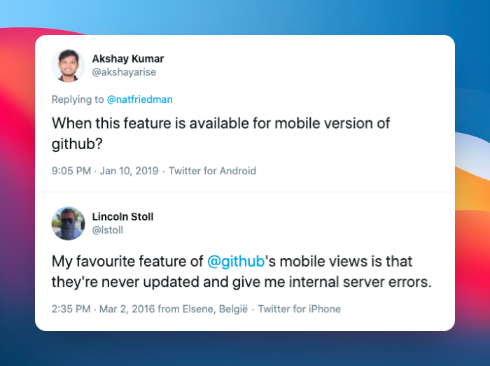
The lack of a responsive web experience was becoming a top user complaint.
Transition to a Responsive Web Design
Acknowledging the limitations of a separate mobile site, GitHub embarked on a journey to create a mobile-first, responsive web experience. This approach was aimed at unifying the user experience across devices, making it easier to manage and introduce new features without the need to maintain separate codebases for mobile and desktop versions.
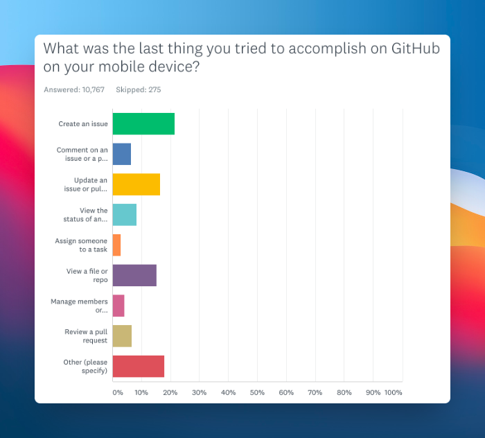
Views with the most demand for responsive web.
Prioritizing Mobile Web Enhancements
GitHub's strategy focused on prioritizing features and improvements that would significantly enhance the mobile web experience. This included making issues easier to manage on mobile devices, enabling code editing, and revamping the UI to be more responsive. These efforts were informed by user feedback and data analysis, guiding the development team on where to focus their efforts.
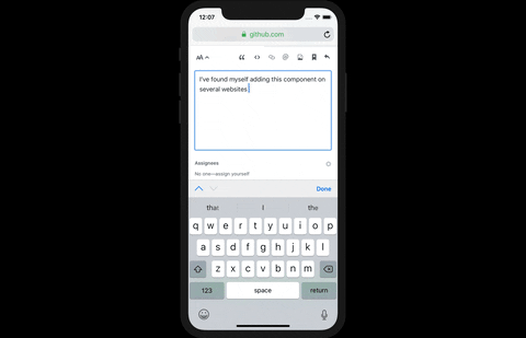
An example of creating an issue.
The WALL-E Initiative: Advancing Responsive Design
With the launch of the WALL-E initiative in mid-2020, the prioritization of GitHub's mobile web strategy was set. This project aimed to deprecate remaining mobile-specific views and tackle GitHub's largest UX challenges by increasing responsive coverage and developing first-class responsive design patterns. This effort involved collaboration across multiple design and engineering teams.

More than 50% of GitHub was not yet responsive.
Key Areas of Responsive Improvement
The WALL-E initiative focused on several key areas to improve the mobile web experience, including enhancing the management of labels and gists, refining responsive overlays, and developing new design patterns for navigation and UI scaling. These improvements aimed to create a consistent and user-friendly experience across all devices.
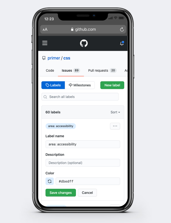
Responsive Labels UI.
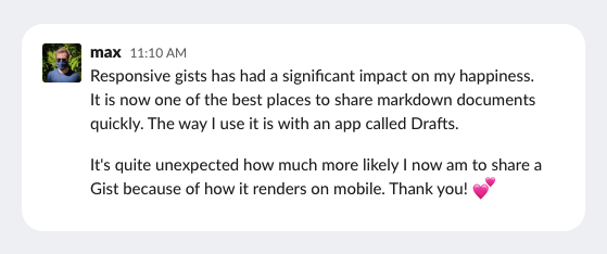
Internal feedback from leadership about responsive Gists.
First-Class Responsive Patterns
Along with deprecating our mobile codebase, we took a closer look at some of our existing design patterns. Many of them are non-responsive, and the ones that are have been retro-fitted to work in our responsive views. Our goal during WALL-E was to revisit these patterns and reimagine them to be mobile-first.
These are the areas we’ve been focused on improving, and plan to continue improving into the future:
- Refining responsive overlay patterns for popovers and menus
- Defining patterns for minimum touch-target areas
- Defining strategy for UI scale on different devices
- Improving menu components for better responsive behavior
- Introducing a responsive toolbar utility for hiding less-important actions in an overflow button
- Defining patterns for local navigation
- Introducing system-level in-page menu/SideNav responsive pattern
The improvements we make with these patterns and components will not only create a consistent and much more user-friendly mobile web experience, but will also help teams quickly build out the UI when developing new features and products.
Deprecating Mobile
Previously we had prioritized deprecating mobile views based on which features customers most wanted most, as well as the effort it would take to replace, and whether it would unblock further responsive work. During WALL-E, our focus was to complete the high priority views such as pull requests, and also to track down all remaining mobile pages and replace with a full-featured responsive web version.
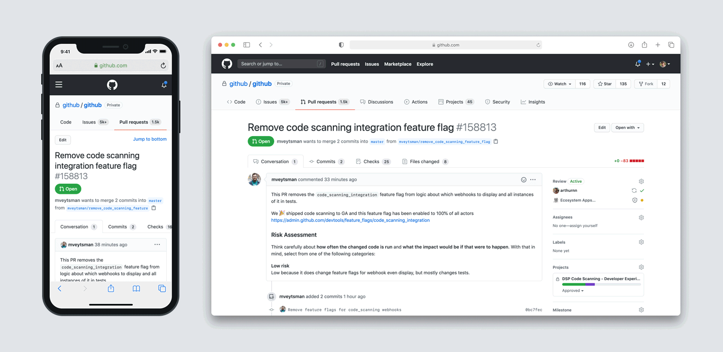
The largest area of remaining mobile views were a part of the pull request flow, accounting for about 70% of the views.
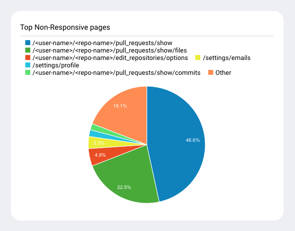
Pull request views that were not yet responsive.
Before kicking off the WALL-E workstream, pull requests were essentially a readonly experience leaving a lot to be desired.
Now, our customers can experience the same features they get on desktop screens:
- Requesting, writing and viewing code reviews
- Viewing file diffs and reviewer comments
- Suggesting changes
- Viewing and responding to questions or comments
- Monitoring checks
- Triaging failed builds
- Resolving security vulnerabilities
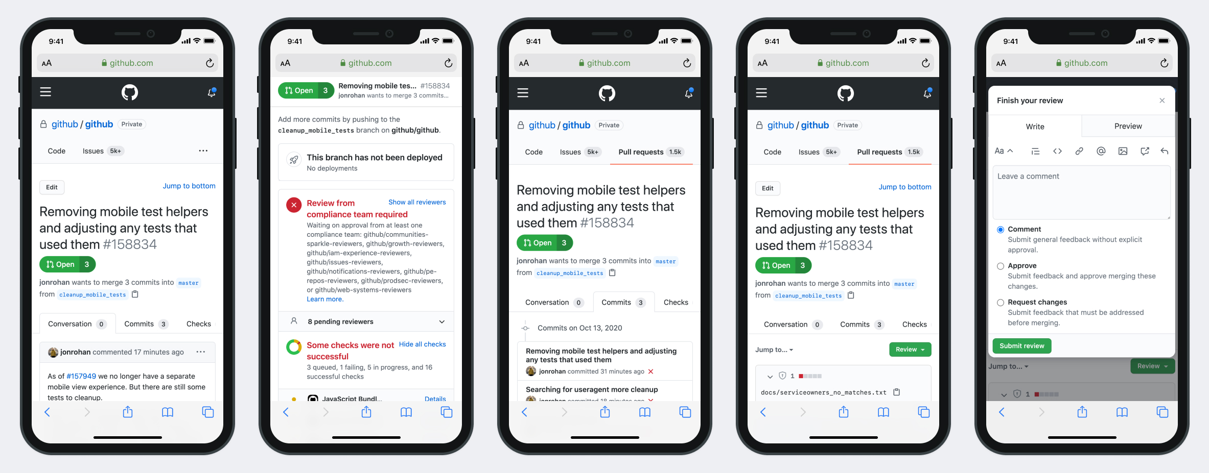
Responsive pull request views.
Conclusion: The Future of Responsive Web at GitHub
GitHub's transition to a responsive web design marks a significant shift in its approach to mobile web development. By focusing on a unified, adaptable user experience, GitHub has laid the groundwork for more efficient feature development and a more cohesive user experience across all devices. This shift not only benefits users but also simplifies the platform's maintenance and development processes, highlighting the importance of responsive design in today's mobile-centric world. And after all of that work, this is where we ended up:
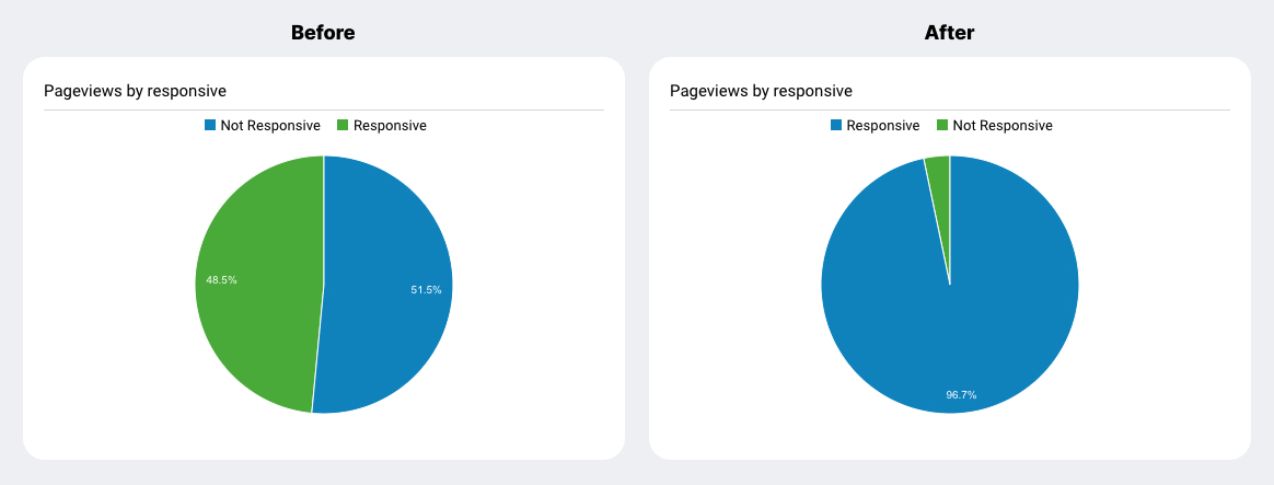
Nearly 97% of all GitHub pages are now responsive.